

EasyClaim
For Better Health Fund Experience.
The major project for User Experience Design at General Assembly can be undertaken a number of ways. My take was to make it easier for people to claim from their private health insurances. I used the " Double Diamond" designing process. This was my initial question:
The websites of private health funds often provide bad content hierarchy of information and poor navigation for users to claim online.
How can we easily find the claim button to make a claim without hassle?
1. The Discovery
Based on my own experience, making a claim from your private health fund is cumbersome. There are just so many steps: you'll have to find a scanner, scan the receipt, and print a form, fill it out, scan it again... When you get stuck and try to call the help line, you end up on hold for a whole other hour. My hypothesis is that this experience is a deterrent for everyone and needs to be improved.
To test this theory, I undertook user research in the form of:
· Face to face interviews with members of private health funds
· Review of websites, apps, annual reports and financial statements from major health insurance companies such as Bupa, Medibank Private, and nib.
Competitive analysis
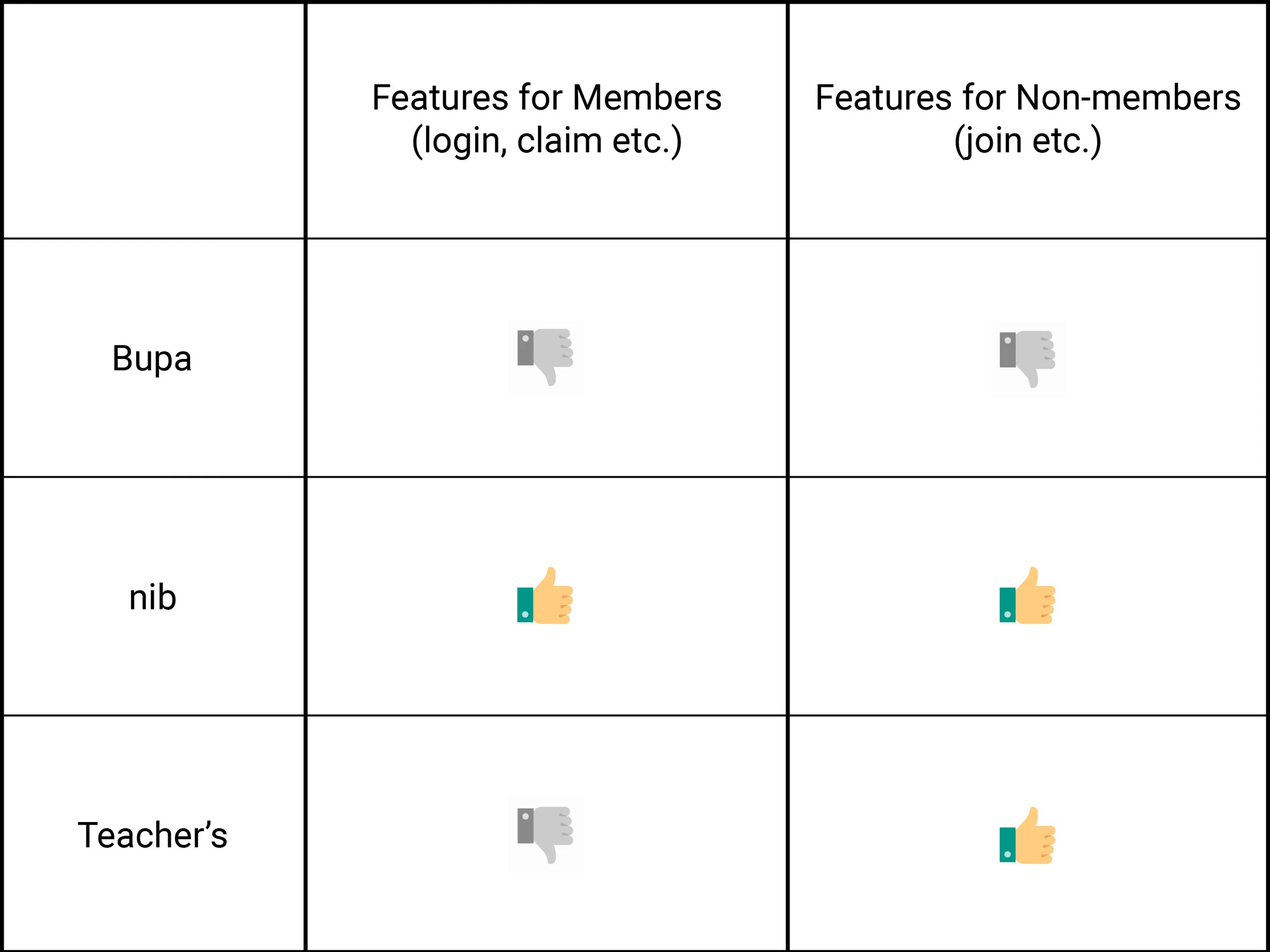
1. Bupa
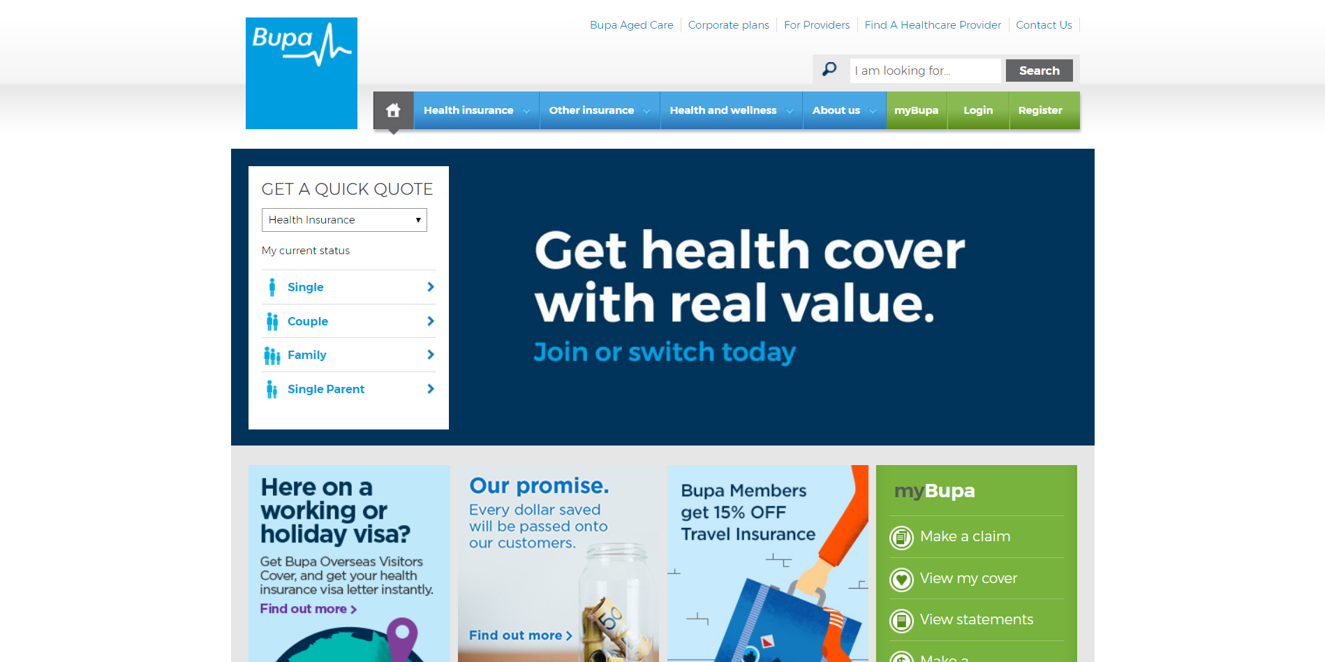
+ Smooth claiming process
- Long wordy form to join
- "Join now" button not noticeable
Analysis: Bupa's login and claim buttons are quite easy to find, and the claiming process is smooth and easy to grasp. But for the potential members, unlike most health fund companies, the "join now" ad is not full screen and is not of a very eye-catching colour. One has to fill out a complex form to get a quote, and even after getting a quote, the "join now" button is not in an ordinary place that people can easily find. Plus, to join the health fund, one has to fill out a wordy form, again.
2. Teacher's Health
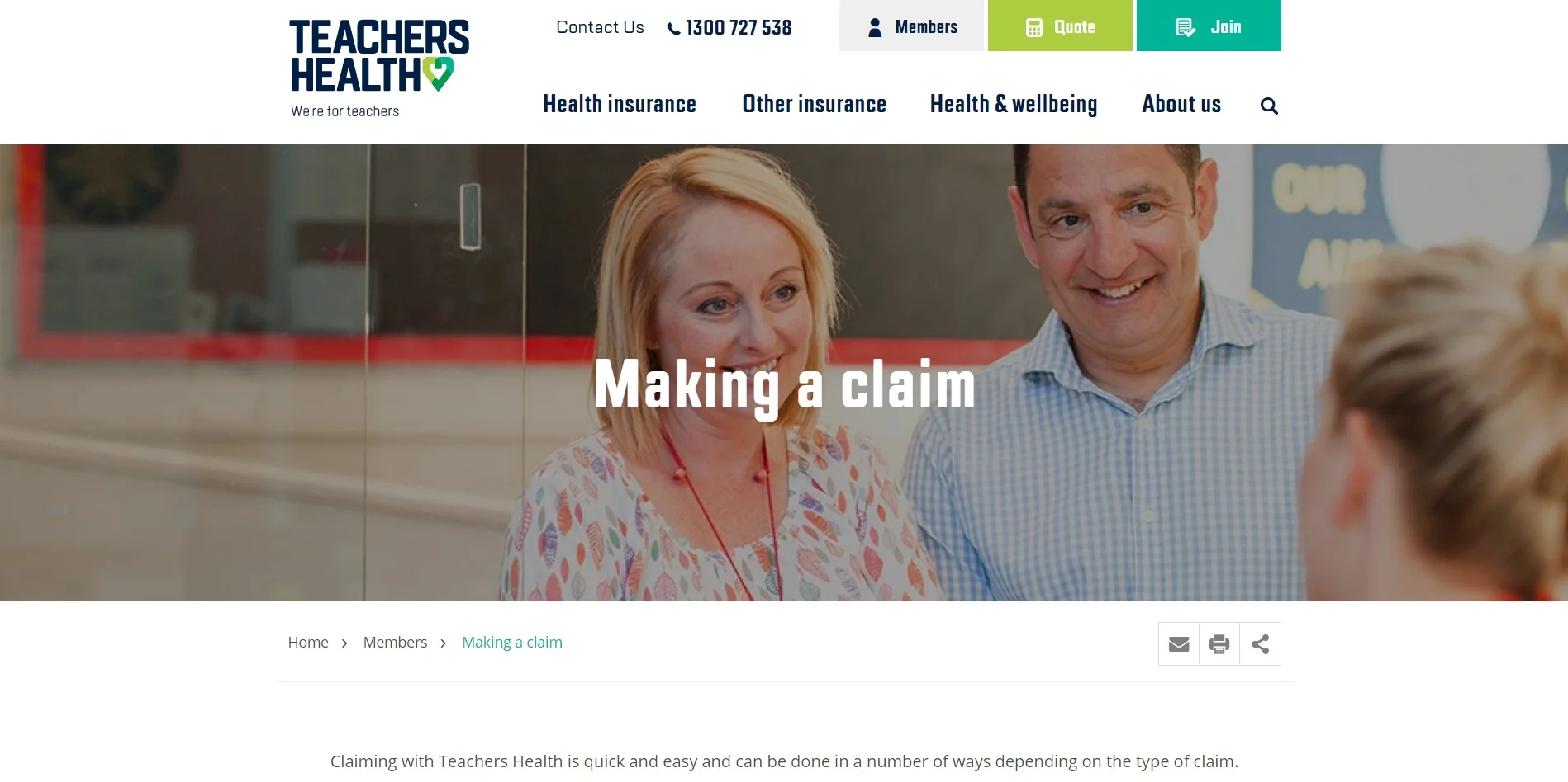
- Login button "members" doesn’t stand out
+ Very easy quote getting steps
+ Clear indications and time estimate when joining
Analysis: For members, the login button doesn't stand out that much, but on the other hand, there is a clear guide on how to get a quote and even an estimate on how long it’s going to take to get a quote on the website and join the health insurance. The form to join the fund has a clean layout and is well designed which makes it easy to follow.
3. nib
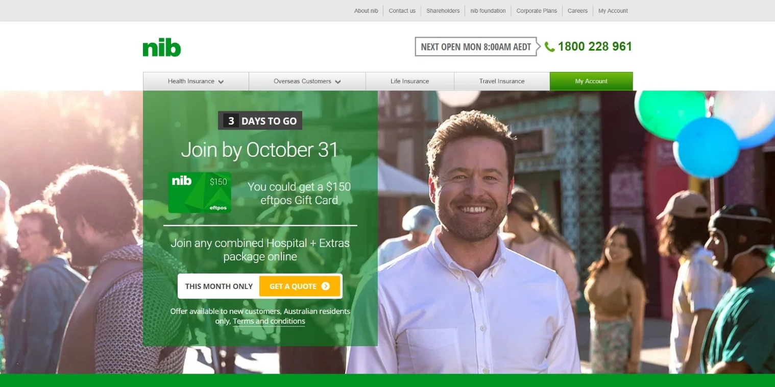
+ Obvious "my account" button for existing customers
- Front page looks like an ad
+ Clean and clear info input to join
Analysis: nib's front-page design is simple and clear, the "my account" button to login is very easy to find. The front page is a full-size "join before 31 Oct" ad, feels like it's rushing you to join, though it is easy to put information to get a quote. To join the health fund, the form is also simple and clear.
User Interviews
During my talk with some private health fund owners I found out that most of them joined a health fund for non-health related reasons. Be it for taxation purposes or requirement for a visa, they ended up not using the fund very often. Other members who are more health conscious, thinking it's worth it to pay for a cover, only visit their health providers around twice a year. In all three cases, when it comes to claiming, they are not familiar with the process at all.
Another one of my findings was that people, no matter how hardworking and well achieved in their career, are generally "lazy" when it comes to their health fund. They seem to never remember to get on track in time when it comes to claiming, checking out their cover, or switching from an unsatisfying cover or company to another. They might not even know what their own cover is, they "just couldn't give a damn".
But they want to save money. My interviewees are from a wide range of financial and social backgrounds, some of them even live in beach-side mansions, but they all care about budgeting at the end of the day.
When they do have to claim, they would normally go to a person in the office as they have tried online / telephone claiming but failed. And most of them never tried to look for information from their health fund's websites or apps.
2. Defining the problem
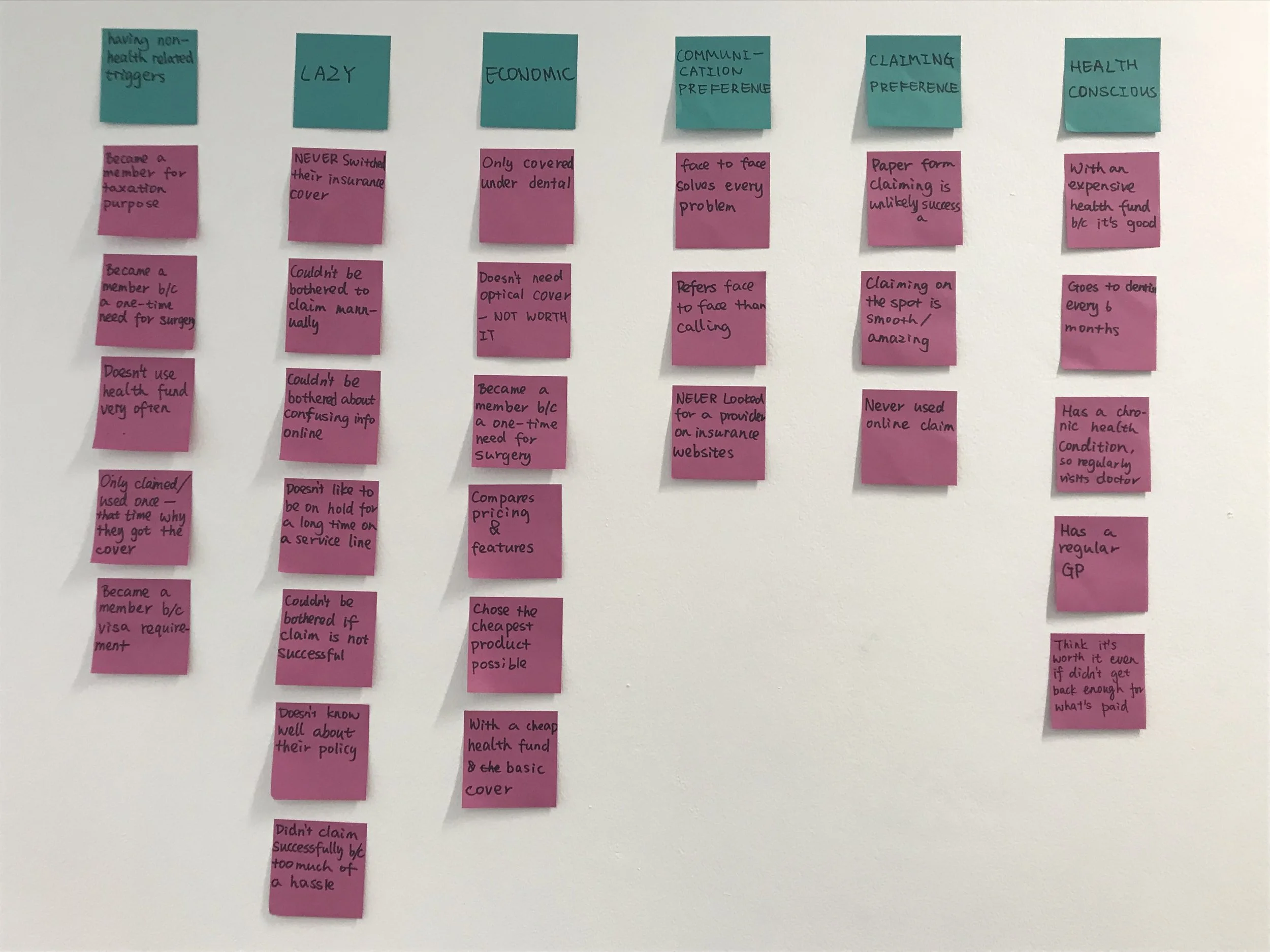
Affinity mapping to find patterns in the data I got from my user interviews.
Insights:
"People prefer face-to-face communication to online or telephone when it comes to making a claim.”
“People are too ‘lazy’ to do anything but want their money back.”
Based on the insights gotten from affinity mapping, a persona was created to guide the development of the solution, serving as robust and practical touch-points for design decisions. Let's meet:
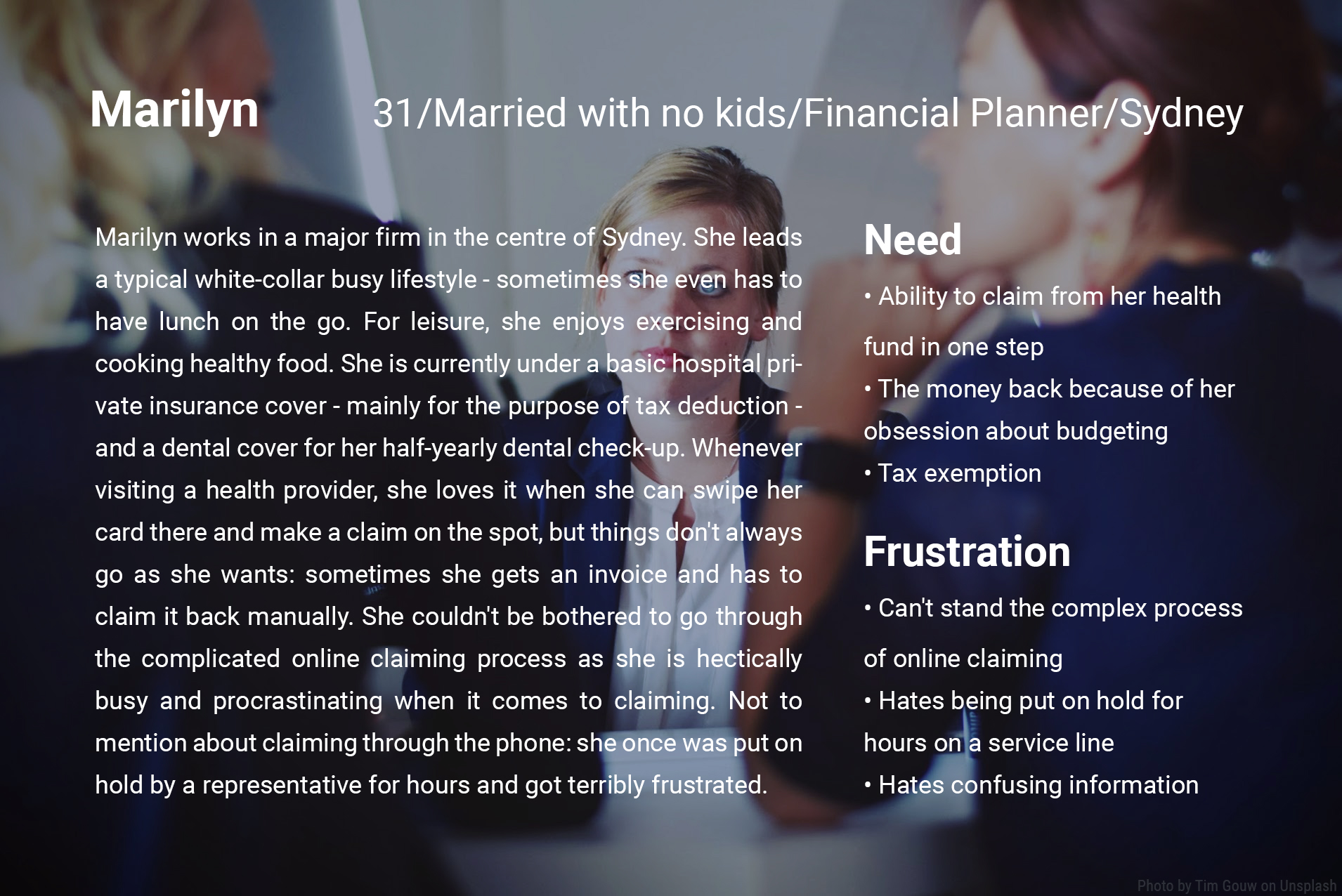

PROBLEM STATEMENT
Marilyn needs a way to claim from her health fund in one step because she is a busy white-collar worker who couldn't be bothered to fill out forms or scan receipts.
3. Explore possibilities
Early sketches: In the ideation process, I brainstormed to come up with various possibilities to solve the problem defined above. I came up with three storyboards describing three scenarios:
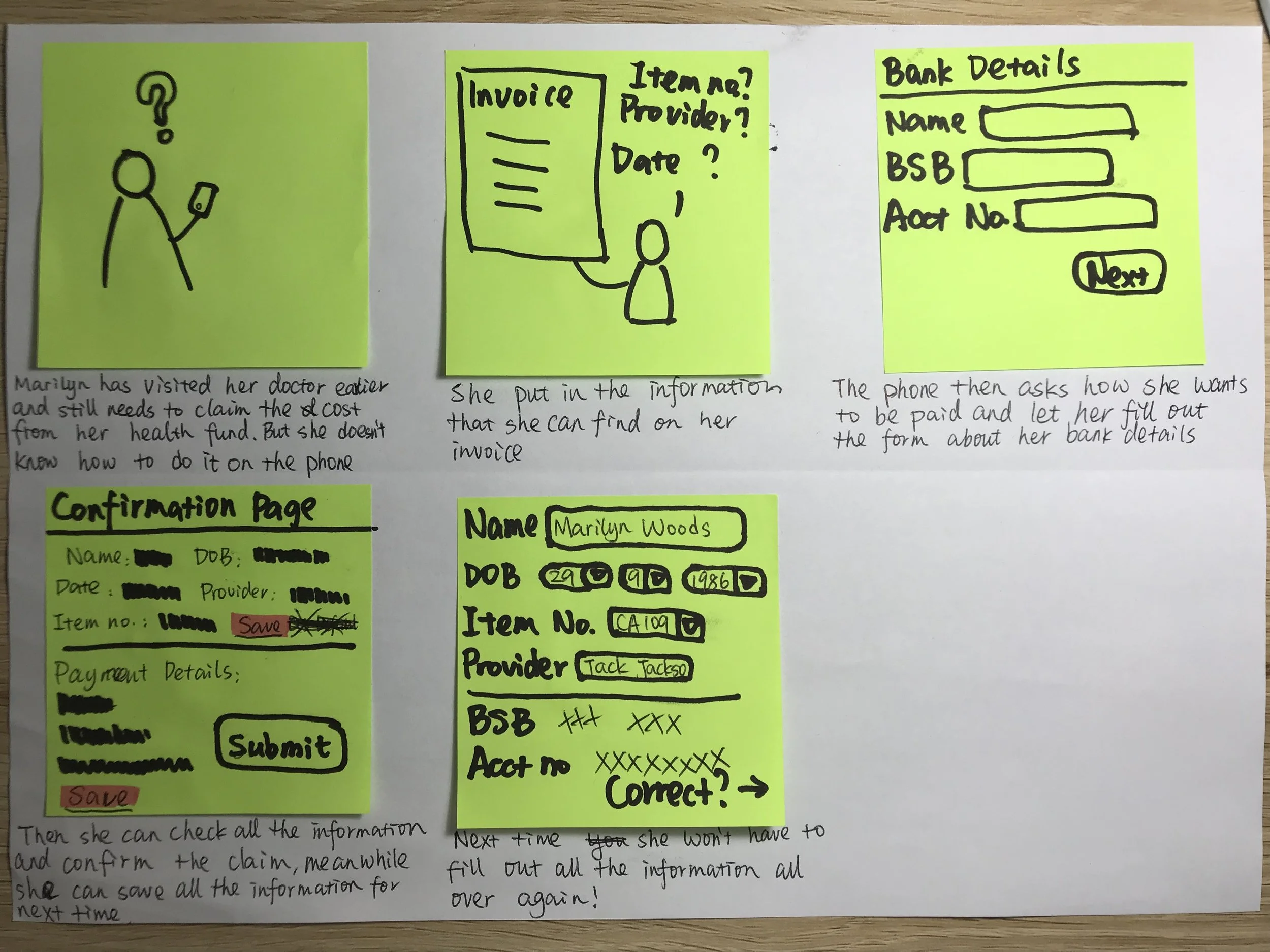
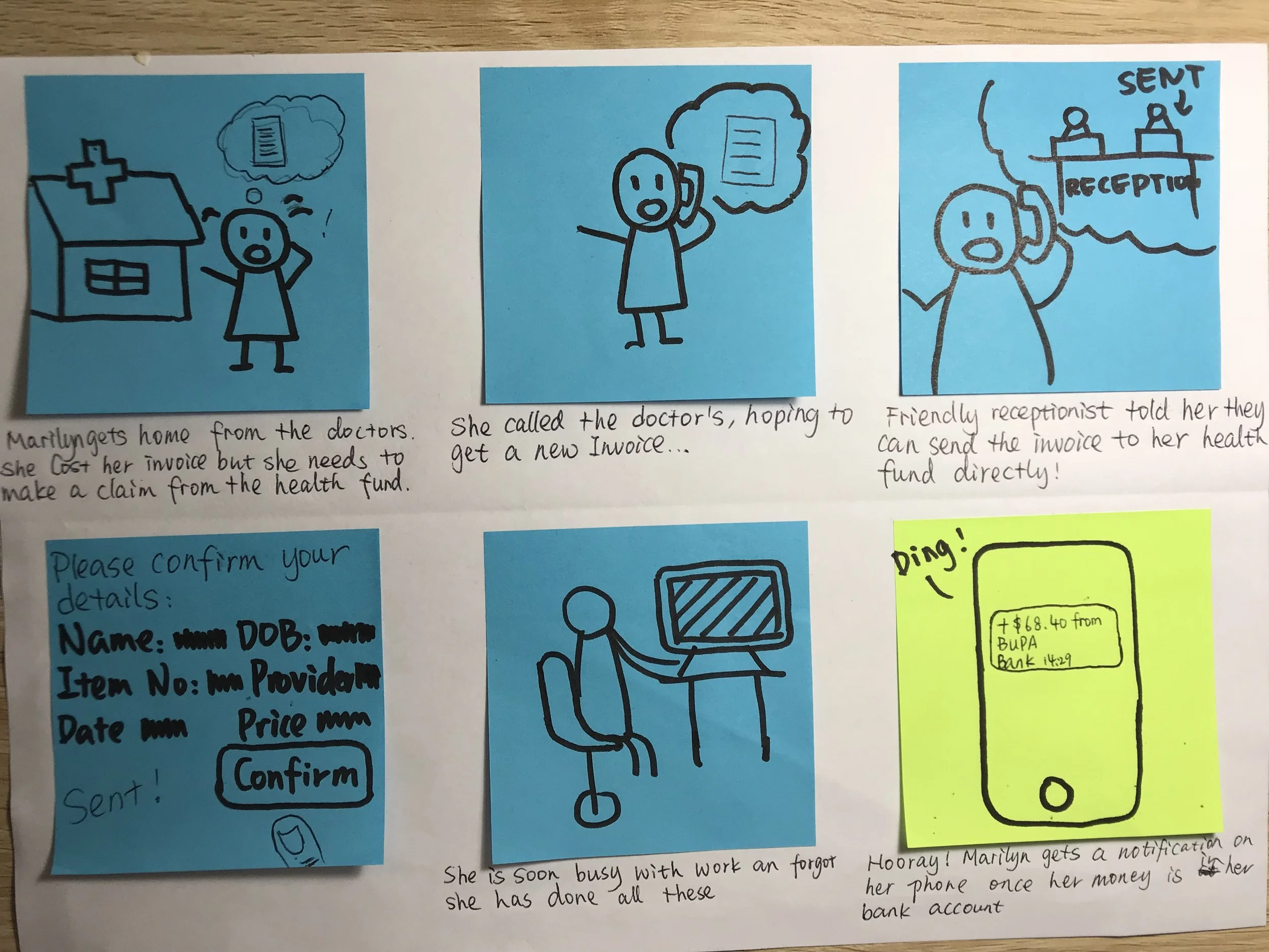
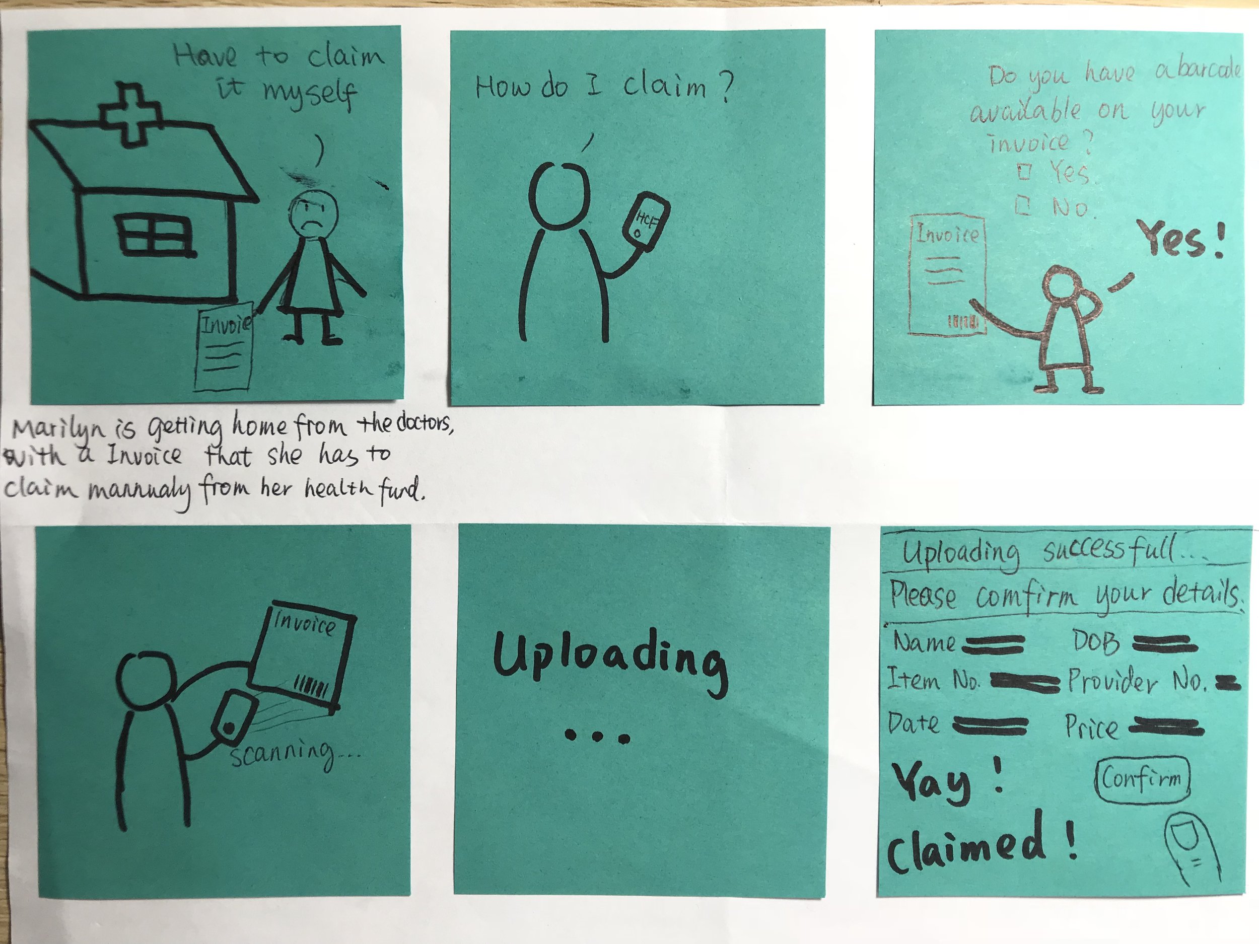
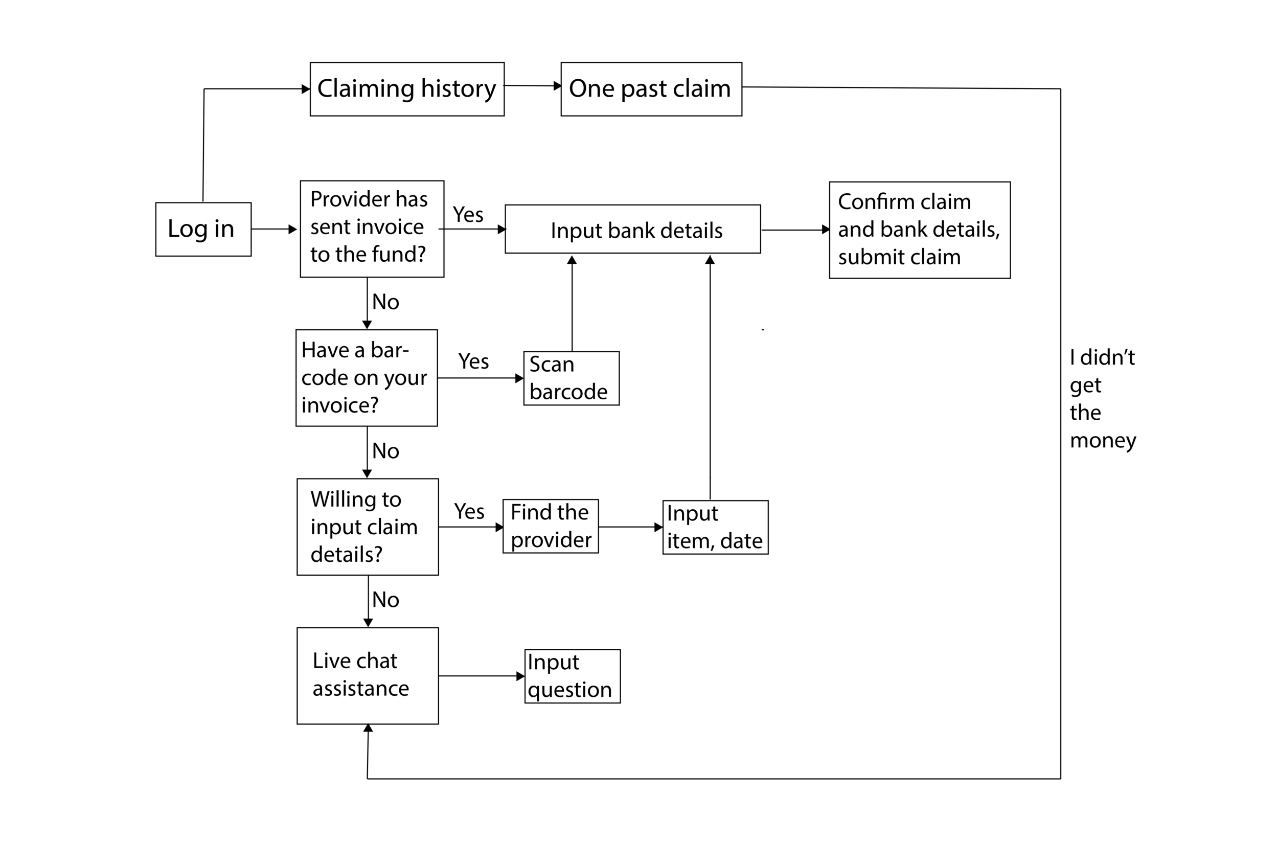
Storyboards helped me sketch out the rough flow of use: the main claiming process that would be run through, and other key functions like saving past information and barcode service. Then I expanded the story boards into User Flow 1:
Iteration 1
Paper prototype testing 101-105
The first paper prototype tests are run under the scenario that users are launching a claim from their health fund. These runs are testing the "claiming process" which is the main function of the app.
According to all the feedback I got, I decided to make changes to my user flow:
User flow 2:
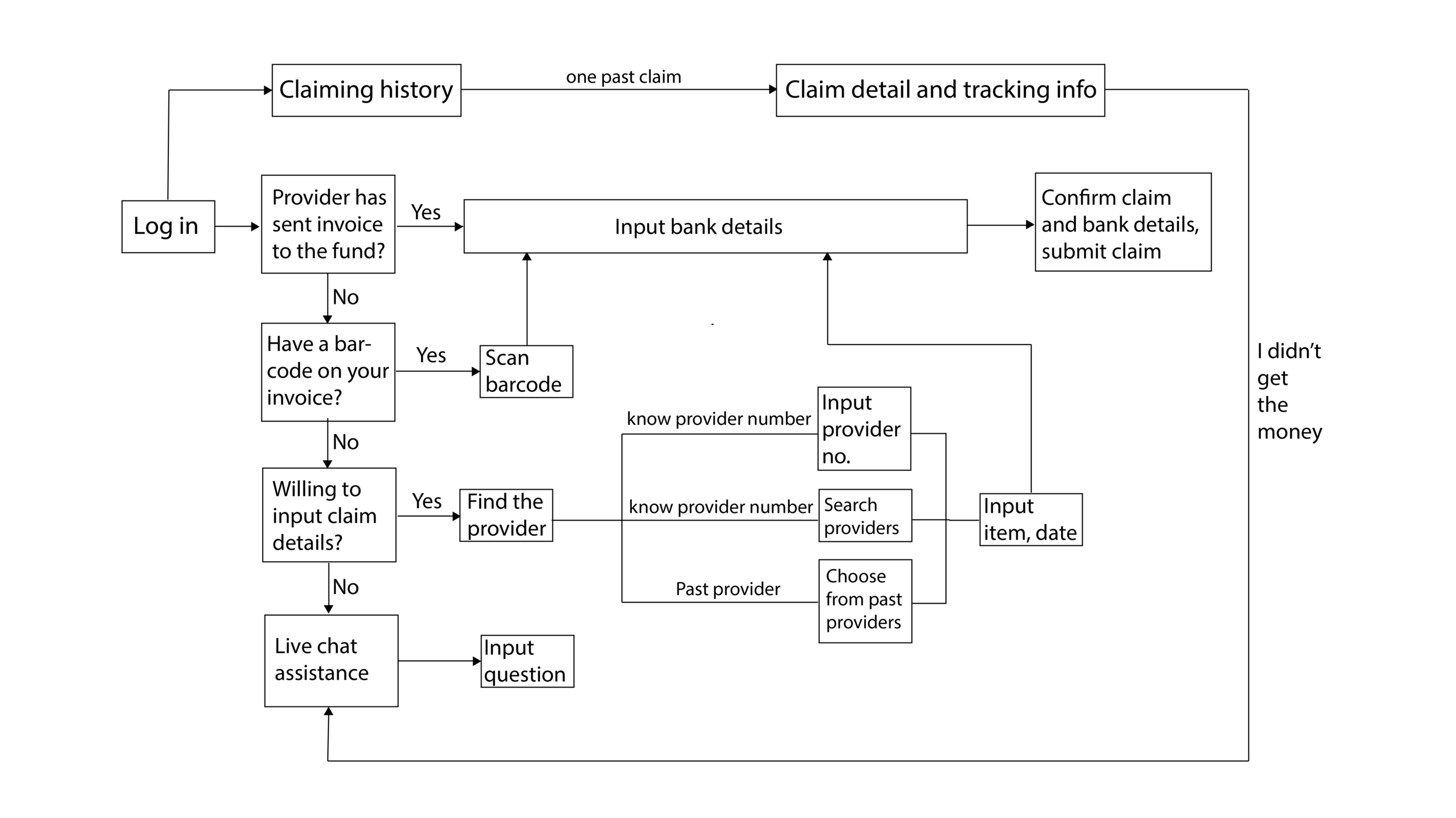
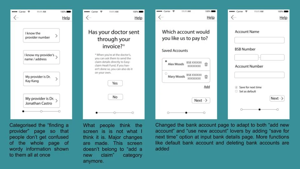
In user flow 2, I categorised the three ways to find the health provider. Instead of putting all the options in one page, I intend to make a neat navigation page which directs to one of the three pages for three options to find the health provider.
I also added a minor function of the app in user flow 2 - tracking pending claims. I got this idea from feedback of some testers, which I'll focus on developing at my later stages.
Iteration 2
The second iteration included wireframing and clickable prototype testing the main function of the app - the claiming process, and research about other potential subsidiary functions: tracking, viewing past claims and live chat.
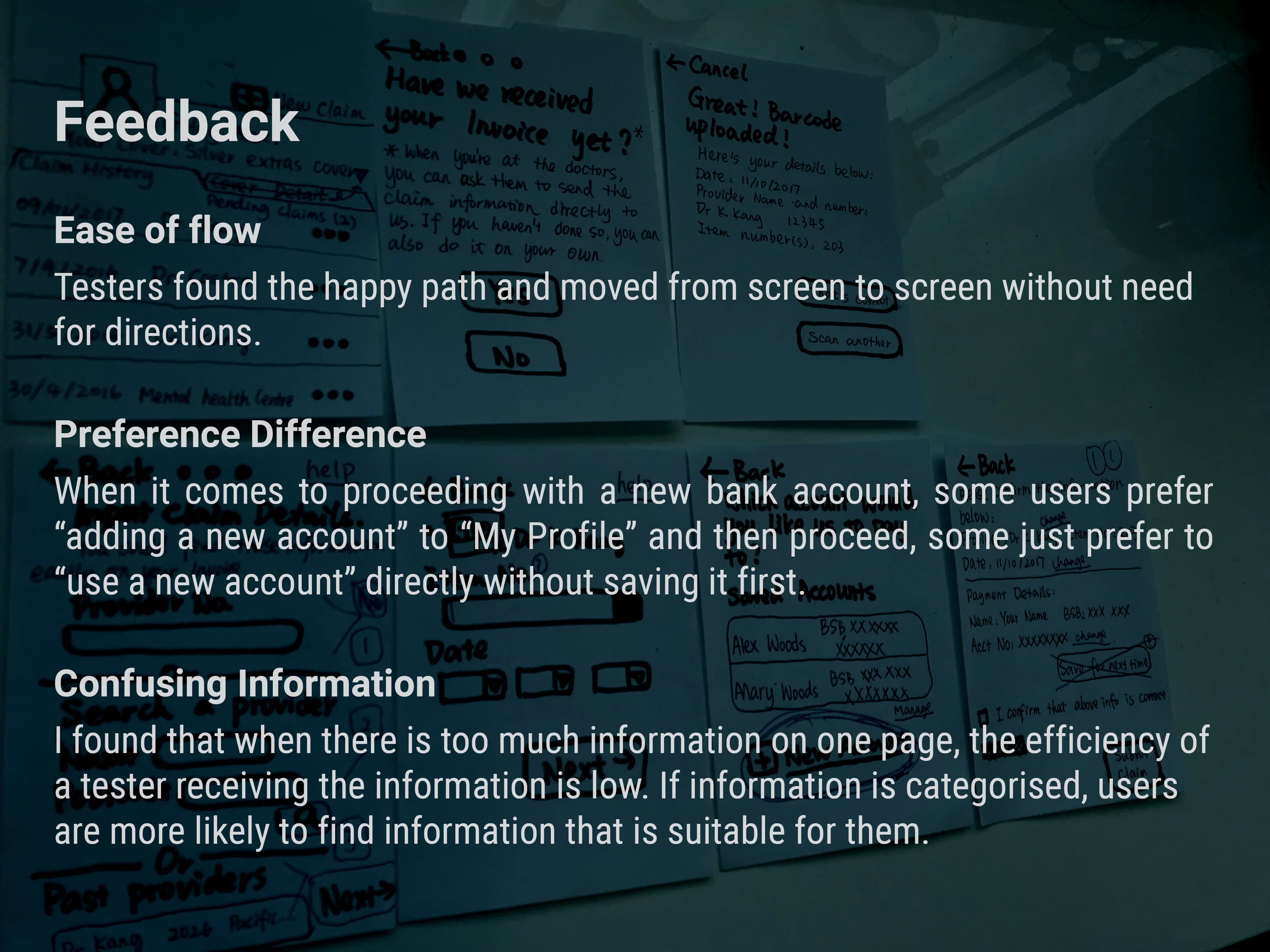
Clickable prototype testing 101-103
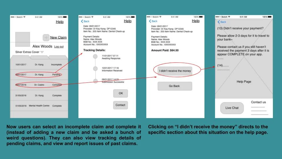
According to user feedback, people want to be able to view their past, pending and incomplete (unsubmitted) claims.
As for support functions of this app, I originally thought if the users need help using the app or generally with their health fund, they would like to be directed to Live Chat, because it might be easy to input any problems encountered there and also, people like to turn to real people if there're problems. However, during prototype testing, people reflected that if there's a button to hit when they didn't receive the money from past claim or have questions claiming, they would want it to direct to the help page. Especially if it indicates the word "help". While in my original design, I hadn’t yet included a help page wireframe.
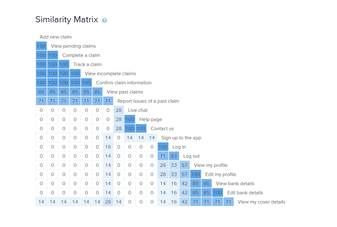
Therefore, I organised a card sort to find out users' mental model - how they think the contents should be related. I did this card sorting with users using OptimalSort. The results can be viewed here.
As a result, all the participants included every card (functions for the app) I created in their categories, even if they are told feel free not to. They typically categorised the cards into 4 groups: Account (Profile), Claim, Support, Login.
I studied the raw data and the Best Merge Method Dendrogram of the card sort process and decided to keep all the functions in the prototype of my next iteration, as in my users’ mental model, all the categories were deemed necessary for the app. As a conclusion, the card sort result can be easily viewed through this dendrogram:

I have also noticed that for some people "past claim" doesn't belong to the category "Claim". Also, as for logging out, a few people excluded it from the category and some others think it belongs to the Account/Profile group. And the "viewing my cover details" card are put it into Account/Profile category by some of the users, while others put it in a few other different categories.
Please view prototype at the end of Iteration 2 here.
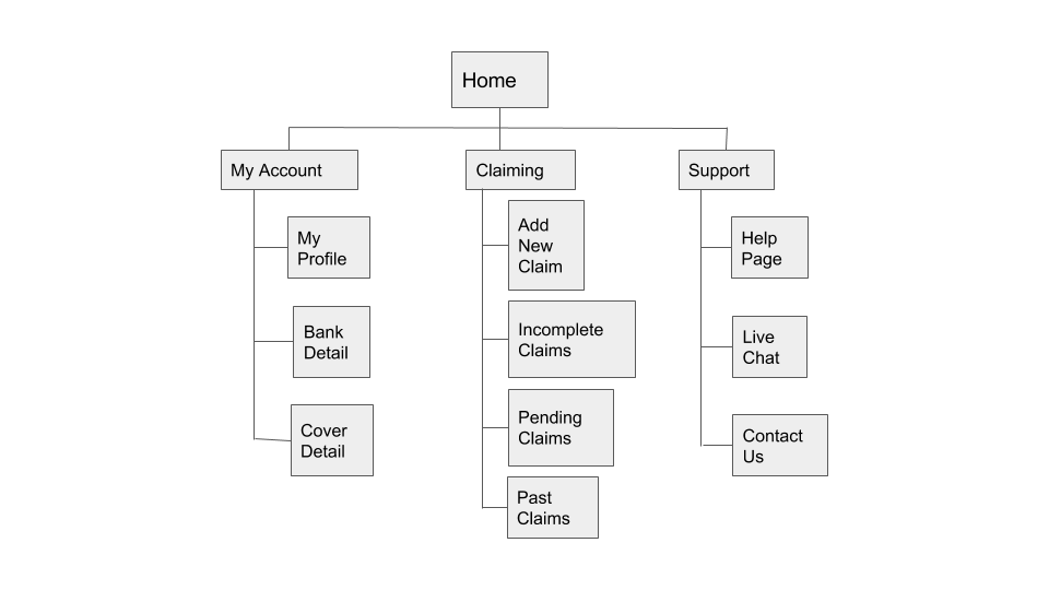
Influenced by mental models of my card sort participants, the following site map represents the content hierarchy I wanted the app to have at this stage.
Iteration 3
Clickable prototype testing 101-102
According to the card sort result and my sitemap, I created all the content I had decided to keep for my app. The third iteration included not only clickable prototype testing of the claiming process; but more importantly testing of newly added subsidiary functions: tracking, viewing past claims and support.
Please view prototype at the end of Iteration 3 here.