


During my time working at Department of Employment and Workplace Relations, I partnered with multidisciplinary teams to improve the Calendar and Booking Management system used by employment providers across Australia. The goal was to undergo an online employment service revamp, including front-end redevelopment of the online platform used by employment service providers across Australia to manage and support clients throughout their job-seeking journey. streamline appointment scheduling, reduce administrative burden, and enhance the experience for both providers and job seekers.
I incorporated user-centred design thinking and consideration for accessibility into the daily booking management system, ensuring an integration of both consultants’ and clients’ schedules, client information and relevant documentations; as well as user-friendly and timely ways for consultants to book in high volumes of appointments with clients daily.
Problem statement: Employment providers faced booking errors and inefficiencies due to a confusing Calendar and Booking system. The challenge was to redesign it for scalability, accessibility, and alignment with service delivery—within strict policy and technical constraints.
- User research - contextual inquiry & usability testing
- Wireframing & conceptualising
- Prototyping
- UI design
- Implementation support in a multi-dsciplinary team
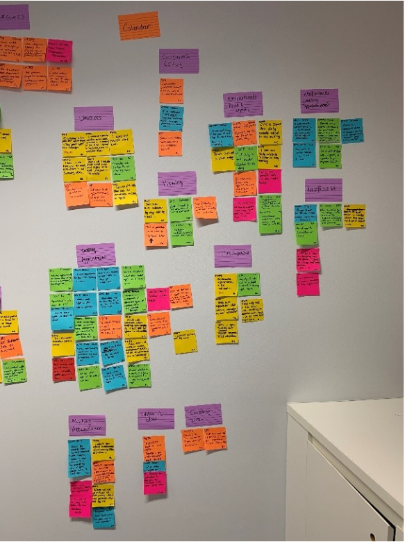
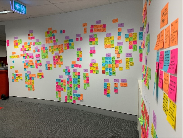
As a result of our Discovery user research round, we gathered data and findings from extensive contextual inquiry with the service providers on the current system and synthesised them into a wall of affinity map in our office hallway. Feedback related to the calendar functionality took up quite some space.
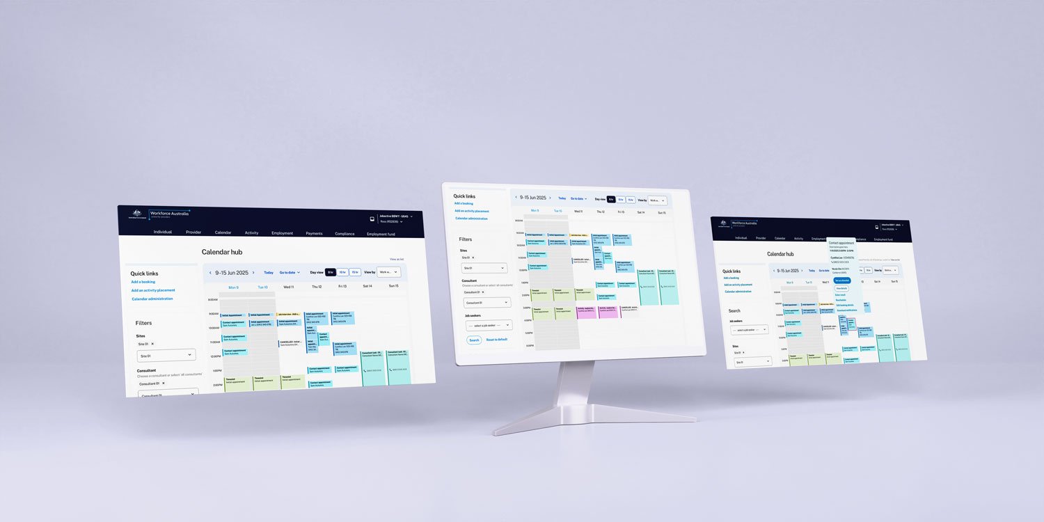
One of the research findings is that users prefer to print or export the calendar because they find the calendar hard to read on screen when many bookings overlap in the same slot. In addition, users easily miss their double-booking, causing problems because they cannot prevent it beforehand.
I have made some thoughtful design decisions to optimise the display of the calendar and improve its usability. By prioritising legibility and reducing interface friction, users are able to quickly and easily understand their schedule at a glance, even if there are multiple entries in the same timeslot. Additionally, by leaving space for users to add new bookings even when time slots are populated, it becomes easier for users to manage their schedule without any unnecessary obstacles.
An overhead light box was introduced to event blocks to contain more information without crowding the area, giving users easy access to frequently used actions.
Another way of managing conflict is to address it from the start. Notifying the user of existing bookings of the same time slot by displaying a banner keeps user informed and helps them make fast and accurate decisions.
Another user research finding is that contact centre users are incredibly quick at using calendar functionalities and completed complex flows by rote.
Experienced employment consultants, especially those who work at a contact centre, are extreme power users of the platform and need to complete repetitive tasks e.g. booking appointments and marking attendance within tight time frames. I have considered this need from users when redesigning:
One page design. Users prefer scrolling than clicking next, so I have condensed all questions in the same page, without compromising spacing to make the page look cluttered. Users can refer back to all information they have entered so far. More importantly, they can see the end of the page which make the task seem far less tedious.
As many fields are pre-populated according to context or system memory as possible. Users need to complete tasks in a very short time, meaning inputting the same address every time they make a new appointment is time consuming.
Since originally consultants’ and clients’ schedule are on separate calendars, it will take some getting used to for users to view both schedules combined on the same calendar UI in the new design. Especially regarding utilising the new filter. However, the filter received positive feedback in the testing sessions, with comments saying being able to filter by booking type or a particular attendance result is helpful in a consultant’s day to day work.
The filter was later updated due to technical limitation. In an ideal world, the system is capable of loading every piece of information on the calendar when no filter is applied, while in reality, due to limited commitment to back-end re-dev and to ensure the system runs smoothly and speedily, it’s much easier to only call back-end data when information is requested by the user. In other words, combining filters with search fields has optimised user experience under our current technical condition.
The redesigned Calendar and Booking Management system delivered measurable improvements in usability, efficiency, and accessibility for employment providers. Through iterative testing and stakeholder engagement, we identified key areas of impact:
· Reduced time and booking errors and double-handling through improved interface logic and clearer workflows.
· Increased provider satisfaction with a more intuitive calendar experience, validated through usability testing.
· Enhanced accessibility and WCAG compliance across the redesigned interface.
Although users could successfully add bookings in the calendar, there is still a cognitive load on user when they need to manually manage conflicting bookings.
It has been recommended that a back-end redevelopment of the calendar data and an automation of conflict detecting be implemented in the next phase to consolidate the cognitive load and effort taken by the user, as identified through usability testing.