


I adopted the following five elements to redesign for Lee Massage and Acupuncture therapy company's website :
Competitive Analysis
User Interview
Ideation
Wireframing
Prototyping & Usability Testing
I strongly believe that an ideal agile environment will have clear separation of positions yet working close together. Short scrum meetings would be essential for UX designers to collaborate with developers who build the product from the beginning.
For this specific project, due to limitations in the work environment as a freelancer, it was hard to achieve true agile delivery. However, I decided on a lean approach to stagger UX/UI work stream and development work stream so that my UX process and UI design are completed (e.g. in sprint 1) before a sprint of developing work (e.g. in sprint 2). In this approach, I have enough time to work and test through the design from all five elements above. In short, if I were to work in an Agile team, I would make sure I don't just hand over my sprint of work and move on, instead, I would advise the team on essential deliverables, allow thorough communication and make adjustments as necessary.
Analysing the functionality of the websites of a few competitive massage companies around the local area, including whether they are providing useful and sufficient information.
Keeping my hypothesis problem statement “Lee Massage & Acupuncture wants to provide online booking service as it is convenient for the users and it can reduce their incoming calls, to make business more efficient.” in mind, I drafted a user research plan to find out what real problems we are facing:
The target audience include massage clients typically aged from 30 to 59, female or male, who have a busy work schedule.
The target audience include people who have had the experience of booking a service such as a restaurant, a concert or a beauty service.
1) Research goals:
To deep-dive in users' current preferred methods of booking a massage (or similar) service.
To determine users' preference of devices when booking a massage (or similar) service.
To discover what is preventing phone bookers from booking online.
To understand if online booking is truly useful and necessary.
2) Method:
5 in-depth user interviews
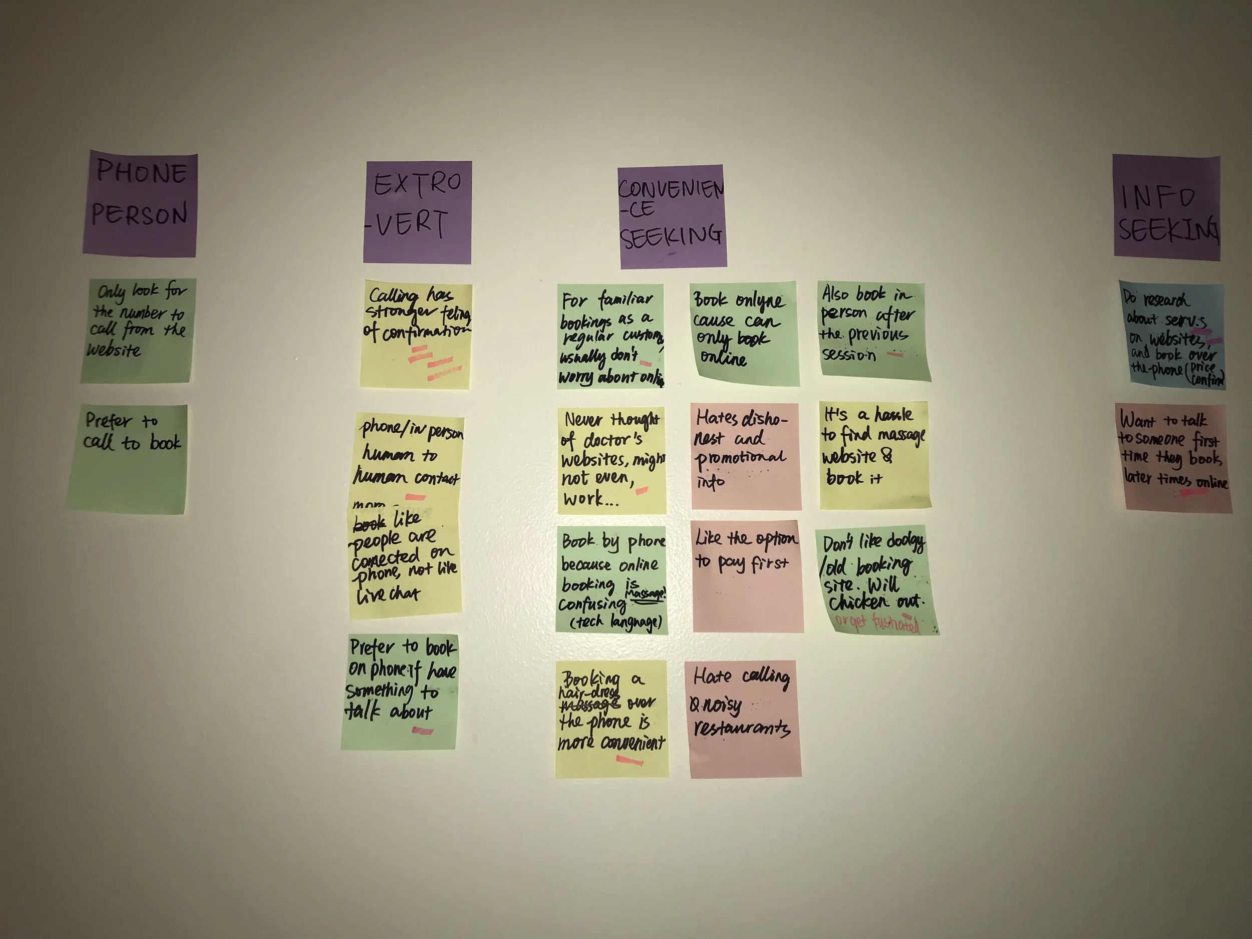
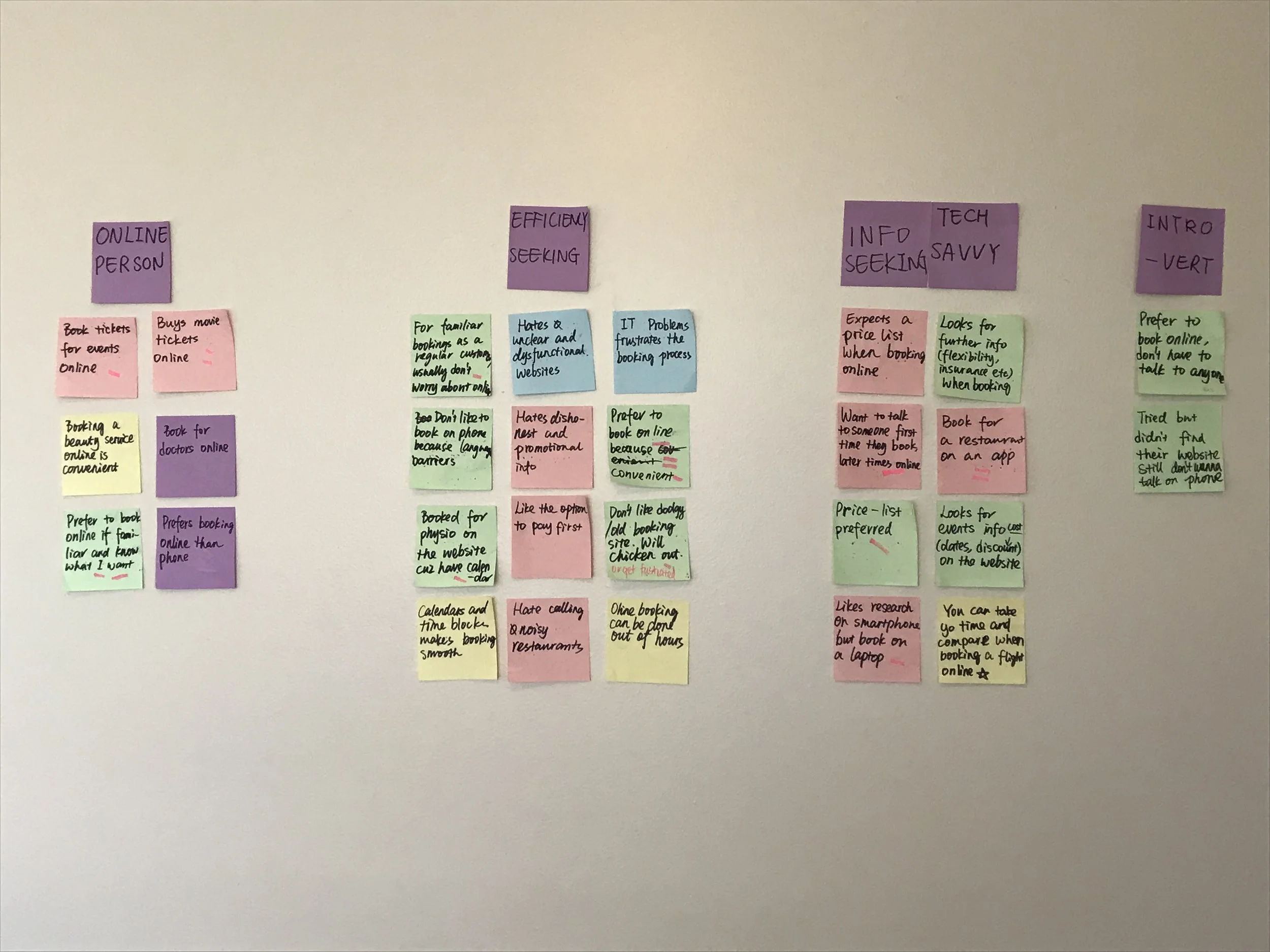
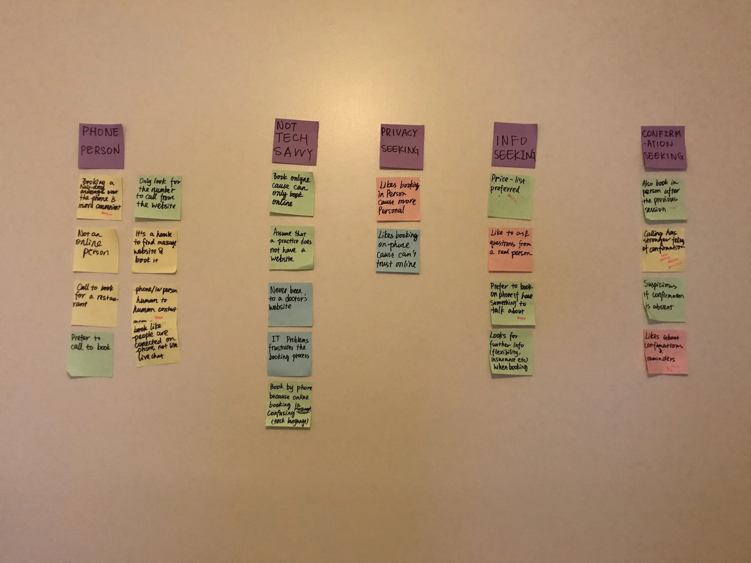
3) Interview findings:
“I prefer to book online because it’s more convenient, you don’t have to talk to anyone or go anywhere.”
“I feel calling on the phone has stronger feeling of confirmation.”
“I do research about products and services on the website, and book over the phone.”
“I like to book for a restaurant on an app.”
“I buy movie tickets online.”
“I prefer to book online if I have done it before and know what I want.”
“I need confirmation (messages or emails) and reminders.”
Affinity mapping to find patterns in the qualitative data of interview findings.
Jayden is an extroverted and straight forward construction worker in Adelaide. His hobbies include beer, parties and tattoos. He likes to speak to strangers and make new friends. That’s why when it comes to booking, he tends to book in person or by calling. With his regular tattoo artist, he would personally get in contact with her and make a booking in person. However, he owns an iPhone and whenever he can only book for something online, he can easily go to its website and get it done as well. Jayden has a chronic muscle injury which makes him need massages occasionally. He normally calls up the clinic to ask about what massage he should get, but because of language barriers he's never satisfied with what he has learned. He can't find the right information on their website either.
Rebecca leads a busy 9 to 5 life in Sydney. She enjoys going to galleries and Japanese restaurants with her partner on weekends. She is a passive friend maker and she normally hangs out with a close friend circle. She is tech savvy and likes exploring handy apps for booking a new restaurant, or discovering booking many services online. She often has neck and shoulder soreness, and gets regular massages for relaxation. The massage clinic she regularly visits, however, does not provide online booking. She has to call up every time - while she doesn't really enjoy talking to a stranger on the phone, and sometimes even needs to wait on the line. Her beauty provider, however, has a functional website with all the information she needs including making bookings.
Jaqueline has just retired. She likes having her children and grandson over for lunch and walking her dog along the beach. Like most people of her age, she is used to the good old traditional ways to book. She’ll either walk in or book in person for her hair dresser and massage. She has an iPad and she reads on the internet every day, but when it comes to booking, she is not sure how efficient and private it’ll be. There is not enough information telling her what she can and cannot book online. Should she pay first? Should she pay a deposit? How can she reschedule or cancel later? Therefore, my revised problem statement is:
“Jayden, Rebecca and Jacqueline want to get the right information efficiently from the website and booking process, and be able to book with a smooth, efficient, quick process with a clear guidance.”
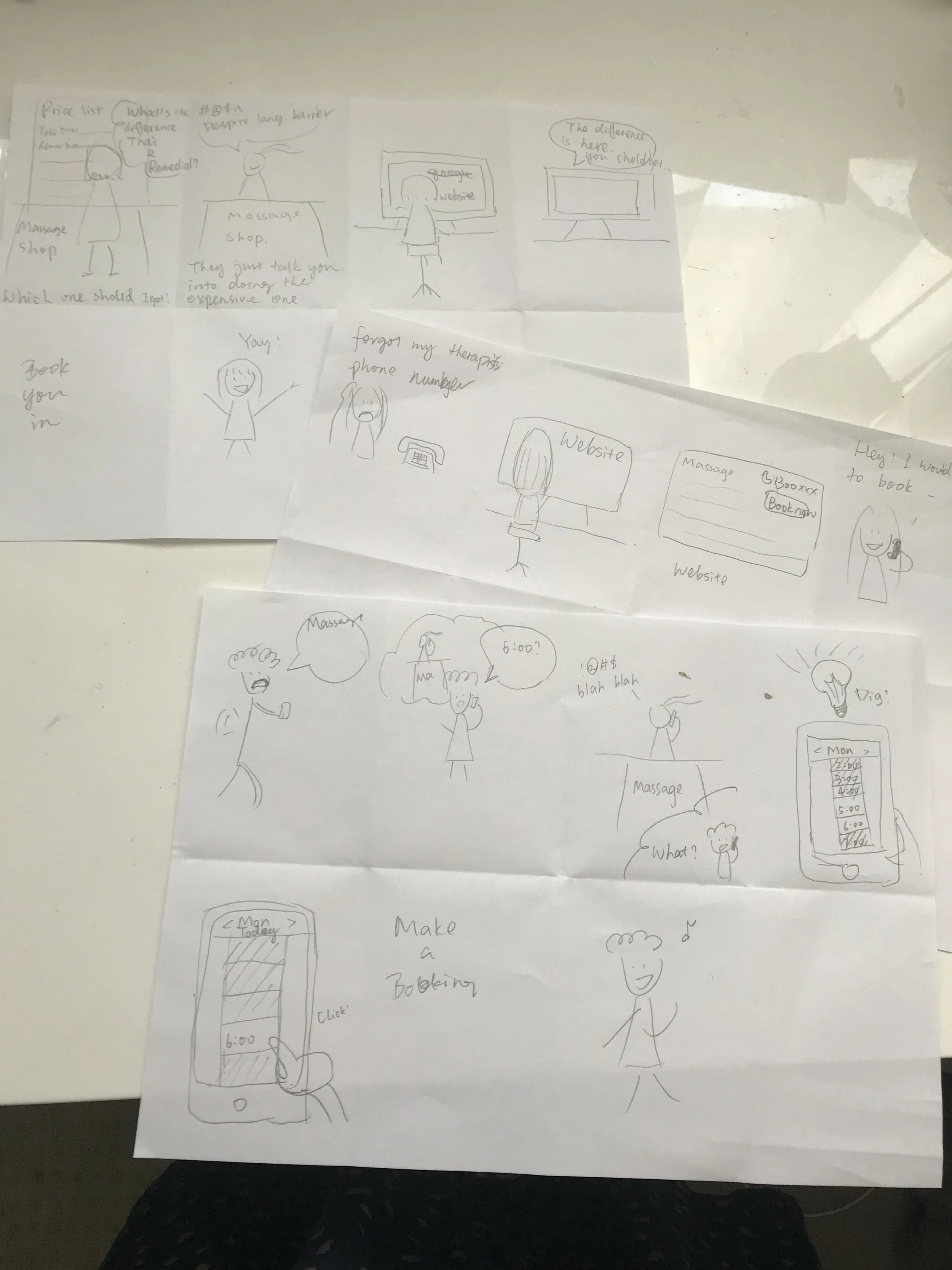
1) Sketching:
I made a few story board sketches on ways of solving Jayden, Rebecca and Jacqueline's frustrations and achieving their goals.
I also did two sketch sessions with existing participants. After deciding what goes on the website, I can start working on a user flow to solve the problem.
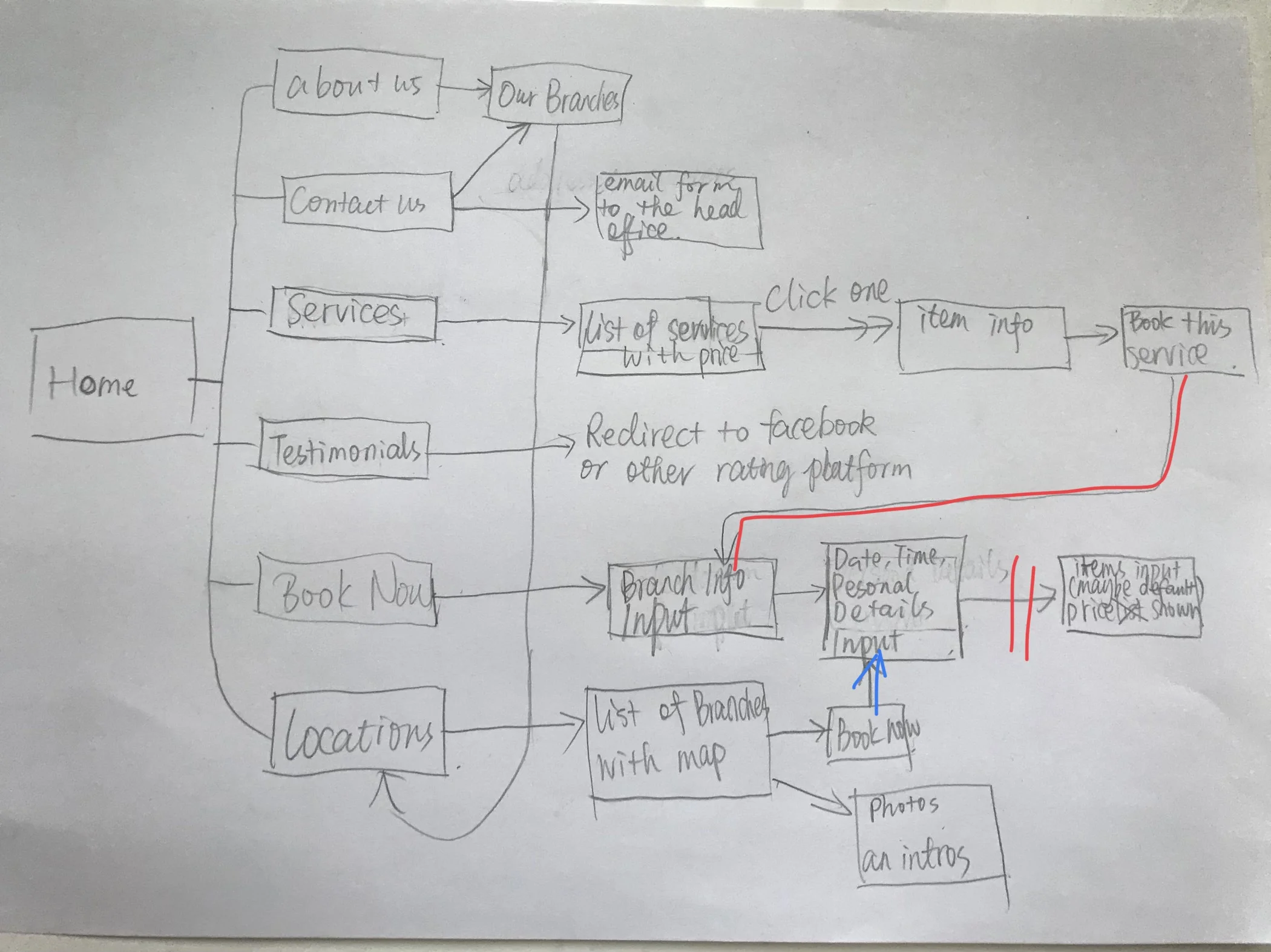
(2) User Flow (v1.0)
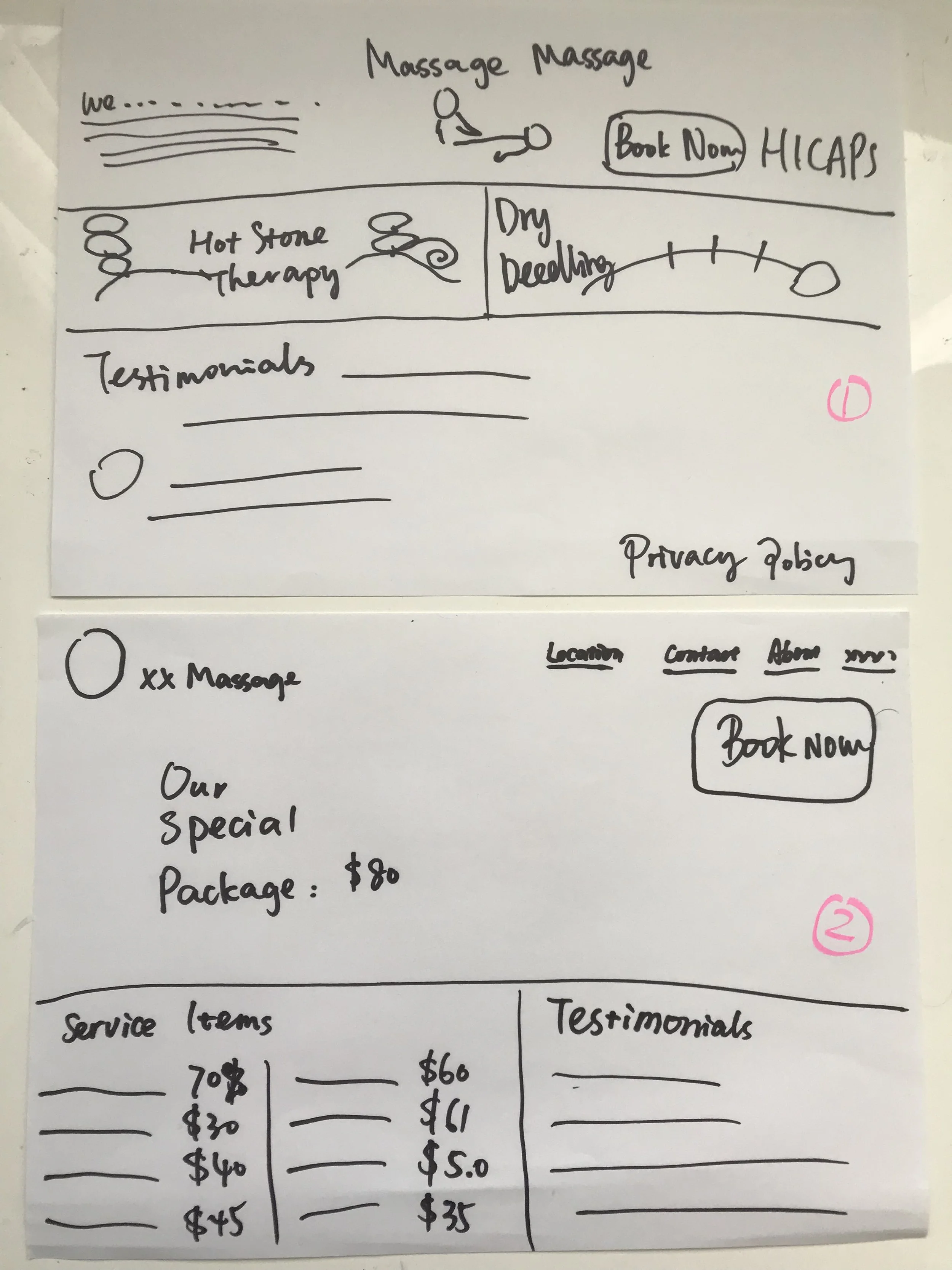
At the earlier stages, I wireframed using Balsamiq Cloud, to get some idea of the function and layout, and of course the flow.
After around 8 wireframes, I came to a pivot about the online booking system. Should it open a new window? Or just a small pop-up window? What should the order of the information input be? Generally, the competitors' online booking system put the item input first, followed by choosing the practitioner, and then a calendar for users to pick date and time, last comes personal information input like name, phone number, email address and a comment area. However, I found that Lee Massage and Acupuncture has different service items for their different branches, and different therapists are eligible for different health funds. And of course, not all services provided by Lee Massage & Acupuncture are covered by private health fund (e.g. cupping therapy or hot stone massage).
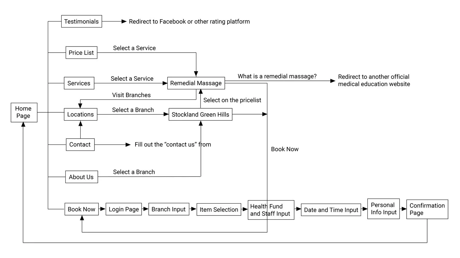
User flow (v2.0)
Usability testing findings and improvements over iterations:
“The login page of online booking is too long. I hardly found the guest login.”
The guiding questions such as "returning customer?" weren’t as obvious as I thought they would be. Instead, I discovered that users would rather read from top to bottom, and take care of every required fields they can see. Also, more scrolling means more distraction, new users are more likely to give up if they didn't see that they can continue as a guest (or sign up) in the first screen. What I have done is shrinking the page into one screen so that users can view all options in one glimpse, and put what users will most likely choose at the top. I have done page shrinking to other pages of this website too, for the same reason.
“Is it asking for my health fund company or membership or what?”
I changed the wording a little bit to clarify.
“If I have a preferred therapist but I don’t have to get her, what do I do?”
My users' mental model is different from this. Users think "anyone" can mean one does not have a preferred therapist. In which case, any information input in the drop-down on the left will be invalid. However, ticking "anyone" can also mean that one has a preferred therapist (chosen in the drop down),but accepts other therapists as well. Therefore, I changed the page as follows to avoid the confusion and ambiguity.
“I prefer something that can tell me how much I’m going to spend.”
Some participants would like the price to be shown on the website. So, on the home page, though the prices vary from branch to branch, I decided to indicate rough price range. I also added price range and other features of a service item.
The latest round of testing received positive feedback from users. Users preferred the clear indication of what information is needed to make a booking.
Although users easily went through the flow to make a booking, upon the confirmation screen and automated confirmation email, some still wonder if their booking is indeed confirmed by the branch. I recommended exploring having users select their preferred method in receiving confirmation by email, SMS text or a phone call (even if it’s automated), and introducing a unique reference number in a future iteration. As identified through user research, this can increases customers’ trust in the digital process.